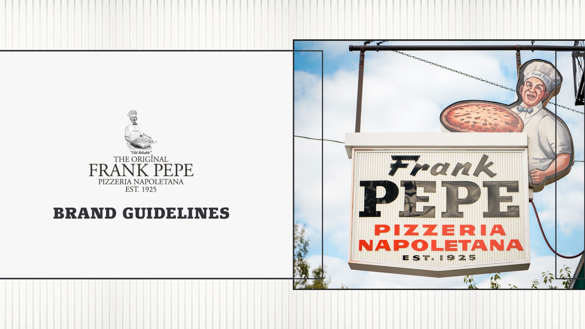
Frank Pepe Brand Guidelines
The Frank Pepe Pizzeria Napoletana Brand Book details general principles to
achieve a consistent representation of the brand design, personality, and values across every touchpoint.
Using this book as a guide to creating experiences that are in alignment with the brand will
require you to use your best judgement when approaching new implementations.
Who We Are

About Frank Pepe
Short and Concise Version
Frank Pepe Pizzeria Napoletana is the original New Haven style
coal fired pizza, a Connecticut tradition since 1925. Our approach is simple:
the best ingredients on the best dough, every time.

Longer Version
Frank Pepe Pizzeria Napoletana is the original New Haven style coal fired pizza, a Connecticut tradition since 1925. Our approach is simple: the best ingredients on the best dough, every time. The way Frank intended.
But, simple doesn’t mean ordinary. We take the best ingredients available- vibrant Italian tomatoes, freshly grated Pecorino Romano, scratch made dough, lively, fresh olive oil- and transform them into the finest pizza in the world, baked expertly in our hand-crafted ovens.
We embrace the heat and prize our charred crust tradition while honoring the simple beauty of exceptional ingredients. It’s not primitive, it’s elemental.
We do things the same way Frank Pepe did them nearly a century ago after settling in New Haven from Italy. When you enjoy a Pepe’s pie, you’re enjoying a slice of history.
Some may say we’re stuck in time. We say we like it that way.
A Brief History Lesson
It started over a century ago in 1920 when Frank Pepe made his way from the Amalfi Coast in Italy to New Haven, Connecticut with little more than his strong work ethic and the support of his wife, Filomena. Like many Italians, Frank had a natural love and appreciation for craft and quality, leading him to work for a macaroni manufacturer and bread baker in New Haven’s growing Little Italy neighborhood.
Driven by their entrepreneurial spirits, Frank and Filomena decided there was no better way to serve their community than with the humble product of their homeland, pizza (pronounced “ah-beets!”, in proper Neapolitan dialect). They started with two simple pies made from the best tomatoes, cheese, olive oil, and anchovies they could get their hands on, baking them in their behemoth bread oven, and sold for 5¢ each from their horse drawn carriage.
As the popularity of their product grew, the Pepe’s decided it was time for people to start coming to them, leading to the opening of their own bakery at 163 Wooster St.- still known today as “The Spot”. Thanks to Frank’s dedication to the craft, Filomena’s financial know-how, and the couple's generous spirit, the pizza was a hit in the neighborhood and The Spot became a gathering place for those craving an authentic taste of home. As Frank Pepe Pizzeria Napoletana flourished, so did the neighborhood, and the Pepe family became a mainstay of the New Haven Italian community.
Today, Frank Pepe Pizzeria Napoletana has grown and evolved quite a bit, but the original premise remains: craft the highest quality pizza around served with passion, kindness, and a deep regard for history and tradition. The product remains largely unchanged in its simplicity- the best possible ingredients, baked to perfection with a charred crust and the perfect amount of chew (the exact recipe remains a secret), and traditional toppings without any gimmicks. You don’t need them when the pizza is this good.
Pepe’s continues to expand, sharing the tradition of New Haven’s original coal fired pizza with the world. What began as an obscure Italian comfort food is now one of America’s most beloved foods and while we won’t say it started with us, it wouldn’t be quite the same without Frank Pepe.
Voice and Tone
To maintain a consistent and confident voice across all touchpoints when speaking on
behalf of the Pepe's brand, we have established a set of guidelines to provide some guardrails.
These "We are" and We are not" characteristics should be used to influence all written or
verbal communication coming from the Frank Pepe brand.

We Are:
-Authoritative. We’ve done what we do for a long time and do it really well. Our confidence has a strong foundation on which it stands.
-Authentic on our own terms. We care about our product and people the same way Frank did. We don’t claim “authenticity” the way it’s thrown around in marketing speak. It’s authenticity the way our founder intended it to be. We don’t have to come out and say it directly; it’s in our DNA.
-Reverent of our history. We are who we are today because of the hardworking people that built Pepe’s and the neighborhood that shaped us.
-Confident, not cocky. Sure, we might have some popular rivals down the block. But we don’t consider them competition. They’re always invited to walk down the street and join us for a slice of the original New Haven pie.
-Proud. Of our Italian heritage, our neighborhood, our people, and our reputation. Being proud and prideful are not one and the same. We’ve earned what we have and always pay respect to those who paved the way.
-Fun, not corny. We’re making pizza, not building bridges.
We Are Not:
-Cute. No gimmicks necessary. When the pizza is this good, you don’t need them. The best jokes don’t have to explain the punchline.
-Trendy. We do what we do. That’s always been enough and we plan to keep it that way.
-Exclusive. While our product may be one of a kind, it’s made for everyone and should bring joy to all who have the chance to enjoy it. If you have tastebuds, you’re invited.
-Modernized. And that’s on purpose. You won’t find anything automated or robotic at Pepe’s. This kind of quality comes from human hands every time. This is a mainstay of our culture.
Visual Identity
Our visual identity is a comprehensive, yet unified system comprising of core
elements such as brandmarks, typography and color . This kit of parts is designed
to be flexible and expandable in order to help us bring our visual identity to life
in creative yet cohesive ways.

Logo and Variations
Adhere to approved marks and colorways shown below
and follow the usage guidelines for logo variations.
Primary Brandmark
Our Primary Logo includes our full name in Garamond font, our founding year,
and our iconic illustration of Frank Pepe. This logo should be used only where there is enough space to
include all details clearly such as pizza boxes, menus, and key focal points of the website.
Full Lockup: Stacked
Full Lockup: Horizontal

Innapropriate Usage

Secondary Brandmark
Our secondary logo uses only text and includes our name and year established.
This logo should be used when there is not enough space for the full primary logo or in applications
where the illustration is unnecessary or unable to be included clearly. This should
be the primary logo for most digital useage including ads, social posts, and website content.


Innapropriate Usage
Frank Pepe Illustration
The Frank Pepe illustration can also be used on its own in some instances.
This should be reserved for very small applications such as social media
avatars or similarly limited spaces.

Innapropriate Usage


Color Palette
Classic Italian inspired color
The Frank Pepe brand uses a classic Italian inspired
color palette unique to our brand which has been influenced
by elements of our restaurants and fresh ingredients. These colors
should not be altered or adjusted to keep color use consistent
across all branded materials.

Char
Fresh Basil
Original Tomato
Wooster White
Firebox
Oven Brick
ADA Compliance
Color Contrast Ratios
To adhere to the standards of the Americans with Disabilities Act
and in making sure our color use is legible and accessible to all,
certain color combinations should be avoided to prevent loss of
clarity or legibility. These rules and ratios are not to be altered.


Typography
The Frank Pepe type family have been chosen based on historic elements
of the brand including original signage,menus, and packaging. Font pairings
should follow the heirarchy below and not stray to maintain consistency.
Primary
Our Headline Font is Siseriff LT Standard. This font choice is inspired by the signage in front of the original Wooster St. Frank Pepe’s and the type used to spell “Pepe”. This should be the go-to display font for headlines across all type touchpoints. It is best for applications of headlines with 10 words or less.

Subhead
Our Subhead Font is “Sprint” and also draws inspiration from the Wooster St. signage. This font choice is meant to accent headlines and should be kept to applications of 5 words or less. Sprint brings nice movement and interest to copy displays while maintaining the original vintage feel of the classic storefront.

Subtitle
Excelsior is our title font meant to accentuate the bold headline choices with an elegant italic pairing. Length of lines using Excelsior is a bit more flexible, but will often be 10 words or less to support a headline. This choice is loosely inspired by the neon “Tomato Pies” signs in all Pepe’s locations and is meant to round out the entire font family.

Body
We use Garamond for body text- the same font used in the Frank Pepe logo. This helps create a strong feeling of consistency across all pieces of copy. Garamond’s old-style serif style maintains a subtle vintage look with high legibility and a structured design.

Font Heirarchy
Establishing the correct hierarchy with our typefaces is the ultimate goal in creating
effective typographic communication pieces. Below is an example of how headlines, subheads and
body copy should work together. Take time to understand our typographic hierarchy system.


Patterns
Our pattern library is inspired by various elements inside Frank Pepe’s- the oven bricks,
unique ceiling tiles, and corrugated texture of the signage outside of the original Wooster St.
location. Patterns are intended to be used across the brand as backgrounds, frames, and a
ccents to other pieces of design. Mixing patterns should largely be avoided as to not make
designed pieces too busy or cluttered.
Ceiling
Tile
Corrugated Sign


Templates
Our Brand Elements In Action
All online and print advertising should take advantage of the same brand
elements to maintain consistency across all touchpoints. Below is a sampling of
templates using our colors, fonts, patterns, and approved images.


If you have any questions regarding this guide or its contents, please contact Russell Champlin at rchamplin@pepespizzeria.com